The diagrams were generated with Nano Banana Pro (most probably, or alternatively with ChatGPT Image 2), if you look closely in high contrast areas you'll see artifacts in the background that give it away.
I personally don't mind AI generated content when it's properly reviewed, but unfortunately more often than not the author just glances at the result and decides it's good enough.
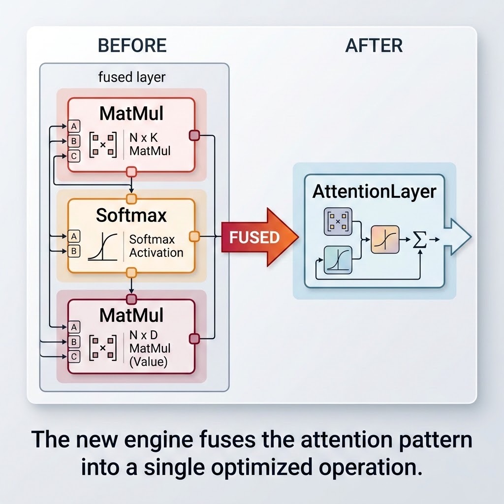
Example: https://opencv.org/wp-content/uploads/2026/06/image-1.jpeg
I'm not knowledgable enough to determine whether this diagram is 100% accurate, but some things look off - the arrows in the bottom left seem superficial, some arrows are connected in weird ways, the mini diagram in AttentionLayer block doesn't look right (it has two Softmax icons and one MatMul icon, while the "before" diagram is the opposite).
Yeah that diagram is all over the place. The arrows on the left branching from the outline of the diagram itself?