Windows 8 Desktop Environment for Linux
Comments
Talking about the design, the further we get from 2012, the more obvious it becomes that windows 8 was kinda like the bauhaus movement for an operating system that wanted to be on touch screens but was made to work on traditional mouse-keyboard interface. It was technically correct, aesthetically pure but socially rejected because it was too stark for the general public (my opinion).
This implementation gets one thing most Metro clones miss, i.e the typography as structure paradigm. In Win8, there were no divider lines or heavy drop shadows to denote hierarchy. The hierarchy was defined strictly by the weight and size of the font.
We spent the last decade drifting back into glassmorphism and mica materials (win11) because people missed the comfort of texture but from a pure information density and rendering performance perspective - the flat, monochromatic 2D plane of windows 8 is a nice tangent. It removed the cognitive load of decoding the UI chrome for touch users.
ps: I'm impressed by the constraint of using native Qt/C++ here instead of taking the easy route with electron or QML/javascript bindings for everything.
As much as the UI was fluid, smooth and probably best for a touch interface, I distinctly remember I hated it and frantically wanted my Start button back on my PC. It is kinda funny reading all the comments about its nostalgia, when all I could think was how annoying it was. I guess to each their own :-).
"look, they ported the worst part of Windows' history to Linux"
Regardless of whether or not this was done for fun or due to actually missing Windows 8(as the author does), it's impressive.
I remember reading some time ago that the windows 8 UI lead got fired but I can't find proof of that now. Maybe it was just satire lol
The only thing worth saving from windows8-10 is the windows border. it is a huge usability win. Clear borders. square (so it's also fast). clear colors showing which window has focus. It's also funny this show up now a day after the top post was the osx windows border radius fiasco.
yet no linux WM has a decent windows8-10 window border clone.
KDE used to but since the rewrite of the theme from kde5+ they not only killed it, but also removed the option to have sane window border color to show focus. Now it's "accent color" which should be non contrast because they will force that same color on toolbars and such, just like all the bad ideas from office-ribbon era.
This is missing the best part of windows 8/metro - the glow around the cursor. I found it really fun playing with how the glow highlighted smooth sections of tile borders as well as illuminating the whole tile. IIRC it also affected window borders, etc. Very fun to play with.
Funny how almost everybody hated the Windows 8 desktop environment. And to this day, Windows 8 is still seen as one of the worst versions of Windows for that reason, even if it was pretty decent under the hood.
Projects like this show that it has its fans. It feels like authors being successful only after their death. I still think of the Windows 8 UI as terrible overall, but now that the hate has passed, people are not afraid to give it some redeeming qualities.
It was pretty good on mobile though, which is the root of the problem I think. They tried to unify what shouldn't be unified.
The only thing I miss about Windows 8.1 is when I hovered my mouse over an application in my taskbar, it showed a little tab preview of what it's doing.
I certainly don't miss that desktop environment, though.
If you want to read some confessions from the guy who is responsible for Windows 8 (Steven Sinofsky) read this blog post: https://hardcoresoftware.learningbyshipping.com/p/108-epilog...
Whole blog is about his time at Microsoft but this particular post mentions windows 8
Apple guy here who actually liked Metro.
Party of one, for sure, LOL
Glad to see an attempt to revive it on Linux
Oh boy. No one wanted this on Windows back when it was released. I’m sure it’ll be a hit with Linux users everywhere.
This could be very nice if it preserves/implements the tablet features.
So nice to see this. I really loved Windows Phone for the simple UI it had which shared a lot of concepts with this. And I felt like Microsoft could have made something really great from the Win8 UI if they had iterated a few more times before dropping it.
I hope you take on that initiative and make the improvements that they didn't
Is there a Windows 98 SP2 Env for Linux? The peak of personal (non-sysadmin) computing experience. There were fewer BSOD than Windows 95, and all DOS games still worked unlike Windows 2000/XP where most DOS games worked.
I use a Windows Metro inspired launcher on Android and it's the best phone UI experience I've ever had: https://play.google.com/store/apps/details?id=com.nfwebdev.l...
I was asking for something like this but for windows 7 sometime ago. A little bit surprised that someone made something so strikingly similar to what I requested.
I hope that somebody creates something like this for windows 7 as well. One can only hope as Windows 7 nostalgia hits hard
I want this for everything, including my phone, tablet, and tele!
I which distro this is being tested on.
The design looks cool, but it surfaces the app launchers as the protagonists of my workflow. I feel that it would be better if it was more about open windows or something in this direction.
Is it just me or does anyone else notice all the little inconsistencies on these "windows ui clones" that show up on linux? I like the idea but looking at the pictures I can't get past the lock screen (font size feels wrong, the borders missing on the input field, the size.. it just all feels wrong somehow I can't explain. That On-Screen-Keyboard squeezed into a tiny square??). On the "start menu" picture the two font sizes near the battery icon, how all the linux apps on display have weird coloring and blues-that-dont-quite-match, the bright greens with white text, etc..
Not to diss the UI attempt at all, I just always seem to spot all these little things/polish every time one of these come up (I've seen so many XP clones where the minimize/maximize/close buttons look out of place and badly shaped, etc..). I genuinely wonder if it's because I spent so much time on these OSes back in the day or if all the DEs being used have some inherent limitations that cause these design inconsistencies.
First thought that popped into my mind is the quote from Bennett Foddy for his game Getting Over It.
--"I made a game for a certain kind of person. To hurt them."
It probably works better than windows 8 ever has... Seeing it might have something called "common sense" over "org driven design".
win8 is the latest version of windows I've used (for about a week before I installed linux, ironically enough. I'm using that laptop right now lol) and I do not remember it being a good experience. Why you would recreate it is beyond me but I think it's neat that folks are doing stuff like this.
Now, if someone wants to recreate win95, I might be interested
Oh helllllllll no. I’ll stick with my Linux. Cool project but Windows is just crap nowadays, even the UI. Best was XP.
No one ever uses/used our windows 8 laptop because it was so horrible. Total waste of money.
As a gnome user I remember thinking I could probably get used to the start screen.
If it doesn't come with a XAML WinRT based framework stack, it is only half way there.
It feels like no one in this thread has actually clicked the link or watched the video demo. Do you people only read titles? Purely from a conceptual point of view, sure, it's a cool project, but the actual UI and UX are abysmal compared to what Windows 8 was. Take one look at the lock screen.
Not to crap on the dev, but ignoring it is also counter-productive: it feels a bit like seeing one of those iPhone 4 clones that ran on J2ME trying to parody iOS - impressive attempt at making a dumb phone look less like a dumb phone, but it was miserable to use or even look at. I see this all the time around Linux UIs, no one has standards and no one wants to point the lack of them out.
This would be nice for a Linux phone.
Nice. I'm an open source guy, but being disappointed with Android's openness (years ago) I got a Nokia Lumia 800 with Windows 10 Mobile (or whatever it was called). Loved that OS. Fast, well integrated. Can't help but keep thinking it would have gone somewhere if they'd kept at it (in the form of Android app compatibility or "the defacto MS365 OS" or something).
Then they'd call it Copilot OS in 2026 and mess it up anyway. So perhaps it's good that it died ;)
There was nothing wrong with the Windows 2000 UI except that it was “boring”. I get wanting to make things feel new, but doing so requires great skill to achieve without losing the functional imperatives, which is exactly what they did with pretty much every design since Win2k.
ugh I still have to administer old w2k12 Metro vms and I hate it
Oh god why
I guess nobody here reminiscing about Windows 8 will mention that the executive in charge of it was texting and emailing with Jeffrey Epstein.
I would be okay to use this DE on a mobile Linux but I'm afraid the usability on desktop is going to suffer like it did with Windows 8.
"Your scientists were so preoccupied with whether or not they could, they didn't stop to think if they should". /jk
Probably nice on a tablet.
Glad to see someone was inspired to do this! I believe the Windows 8 UI was good - one of my unpopular opinions explained below.
I never personally owned a Windows 8 computer, but I used some at work. I logged in to Windows Server 2012 and 2012 R2 on a daily bases for several years - these had the same type of start menu.
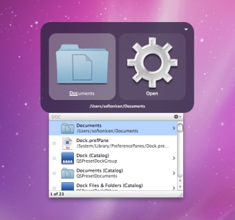
Prior to this experience on Windows, I was a Mac OS X "power user" enjoying Quicksilver[0][1] on Snow Leopard (10.6) through (Mavericks 10.9). It's mode of interaction[2] was very similar to Spotlight[3] built-in to modern macOS.
I also learned to touch type on that very same *MacBook while waiting for a plane in an airport terminal.
All this is to say that the concept of hitting a key and typing to launch an application felt very natural to me when I first encountered the Windows 8 UI. I never felt the need to use a traditional start menu, despite having clocked lots of hours on Windows 7, Server 2008 R2, and older versions. in the office. When Windows 10 brought back the traditional start menu, I only ever searched through it like I would have on a Windows 8 or MacOS system.
Recent benchmark testing[4] showed Windows 8.1 to be faster in many ways compared to Windows 10 and Windows 11. I was surprised someone actually did this, but not surprised at the results!
Perhaps one of the reasons why I preferred it more than Windows 10 and Winows 11 is the Control Panel was still very usable in Windows 8. As someone who worked on Server versions of Windows, the Control Panel was very much embedded in my muscle memory. The erosion of it in subsequent versions of Windows is the source of my growing pains. That, plus all of the popular reasons why Microsoft/Windows gets backlash today.
* The 2010 MacBook was advertized with a 10 hour battery life. Many years would pass before Apple would again advertize such a long battery lifetime. I had upgraded the RAM and swapped the optical drive for a second 2.5 hard disk, then re-installed Mac OS X in software RAID1 mode. It was extremely stable for many years until the day I decided to decomission it (ran 'sudo rm -rf /' at the Terminal). I.e., the type of stuff that would give Tim Cook indegestion.
[0] https://en.wikipedia.org/wiki/Quicksilver_(software)
[1] https://github.com/quicksilver/Quicksilver
[2] https://images.sftcdn.net/images/t_app-cover-s,f_auto/p/7e76...
[3] https://en.wikipedia.org/wiki/Spotlight_(Apple)
[4] https://meterpreter.org/the-20-year-showdown-why-windows-8-1...
Please permanently delete this repo forever.
I am having nightmares right now.
The smooth, tile-based interface of Metro/Modern UI of Windows 8 and the Windows Phone are underrated in my opinion. It was simple, fast, and focused on touch. While I didn't have a touch-based Windows 8 laptop or tablet at the time, I had a Windows Phone, and I enjoyed using it more than any other device I've had since.