 alt Hacker News
To me the pinnacle of icons was always the MagicWB [0] / MUI [1] style, even though I never really had MagicWB on my systems. Maybe strange choice of colors (pale blue, pink, orange?), but nice dithering and color interplay to create neat 3D illusion built nicely upon the OS 2.0 look.
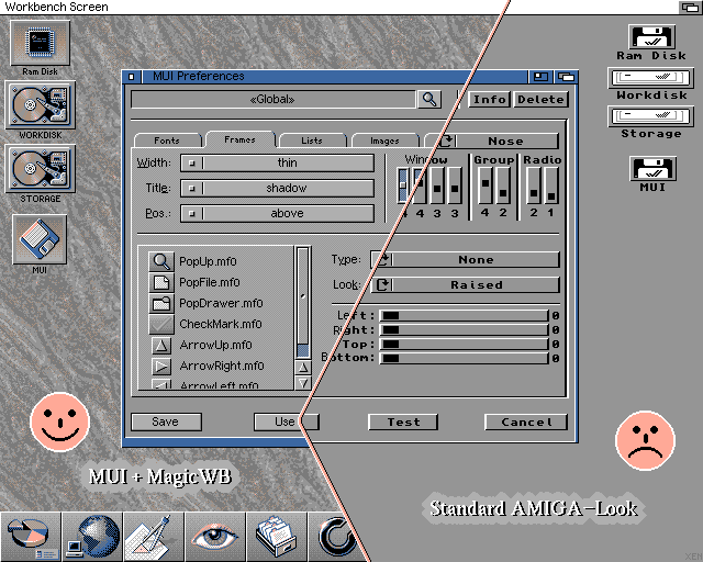
It definitely has the Vaporwave aesthetic. Would love to try and test this for usability.