 alt Hacker News
Completely with you. I've played with limited syntax highlighting in the past (class names were blue, to answer the question in TFA), but for the past few years I've been running with plain black-on-white, with only a green highlight for comments, and a subtle yellow for strings.
https://i.xkqr.org/lighttheme.png
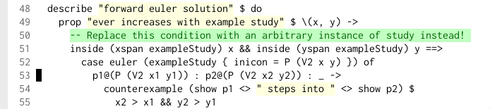
I think the relatively bold highlighting of comments is important – lots of times I'm the only person to react to incorrect comments because people's themes blur them into the background and they stop reading them.
(But then again, I'm crazy. I colour diffs blue and orange: https://i.xkqr.org/blueyellowdiffs.png inspired by similar advice in https://jameshfisher.com/2014/05/11/your-syntax-highlighter-... I think it has worked to help me notice things other reviewers have not, but it's hard to know for sure.)

Replies
Thanks for sharing I love this theme. Implementing it now this morning and really appreciate the middle ground between no highlighting and the popular rainbow chaos themes.
Agreed 100% on highlighting the comments, that's what I also prefer and many themes still get wrong.
I get the origins of low contrast comments - auto-generated stuff in old Java code was basically a box ticking exercise to please checkers that only checked if comments were available, probably for javadoc purposes, making these comments useless noise.
But that's only Java, and I want to believe most people moved away from box ticking exercises like javadoc blocks. Comments should be important and thus high contrast.