 alt Hacker News
AI-generated posters don’t have to be horrible
Comments
Sure, you can get any style you like, but /you will pull those little icons lining the list of activities at your county fair from my cold robotic hands/
Something horrible I've noticed with a lot of AI-generated design is the size of the typeface.
There's a menu for a place in my town and it's completely illegible. They printed the same thing in three sizes, and you need a magnifying glass to see the text on the smallest two.
Accessibility matters, and is part of the job of a designer. The problem with AI tools is that by skipping the expert, you risk making some horrible mistakes.
Can someone post an event poster that they think is incredible? These posters all look fine to me, but the comments seem to know much better ones - but at least in my memory I can’t recall any much better.
I grabbed an old Obon festival flyer from 2014 and told chatgtp to:
"look at this image and give me variants in the style of classical japanese artists and graphics designers (be sure to include hokusai and Ikko Tanaka). be sure to tell me about each style. upscale and include the original with some designer words that are plausible"
at least two of these don't look like AI to me and are perhaps better than the original. but a non-designer is likely to pick the more busy ones.
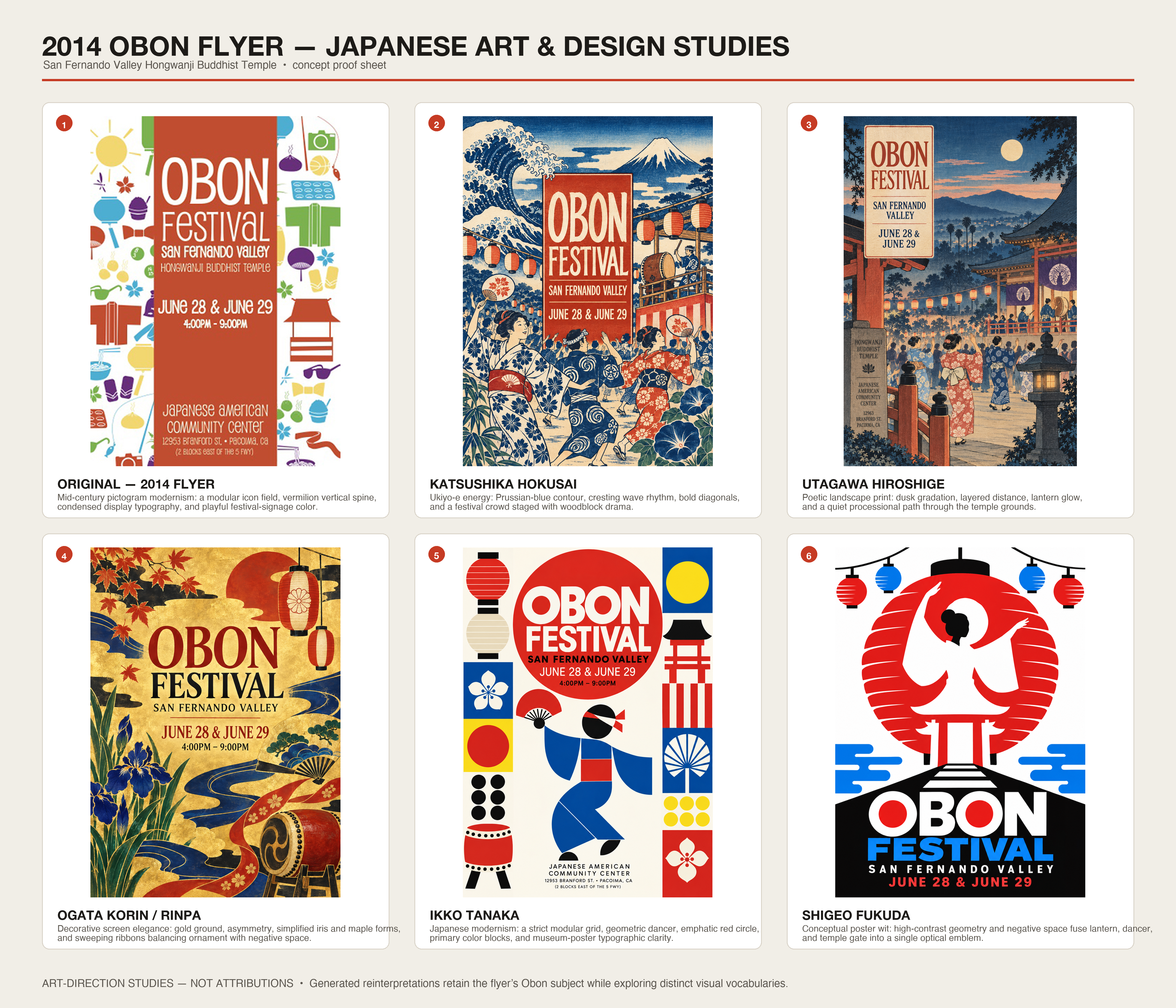
I love this posting. Taste is something that needs to be worked for. It doesn’t matter how well the tool renders the output if the tool user has not taste (me included).
In the future I think that users will learn more, and tools will get better. The true tell of AI usage will be that a small organization will have a beautiful poster. That was never possible in the past.
I feel like ChatGPT Images 2.5 is another step up in terms of quality of designs. But it still needs to be told very specifically what to generate. A generic output is in turn due to a generic input.
It's not that the first one is so awful in isolation, it's that they are everywhere you look when you walk down the street. The barbers, the school fête, the cafe, the church. Everywhere.
Going to these events sounds like too much work. Couldn't AI just give me a summary of the event? It could even play some AI music similar the band that performed.
One thing you can do that never seems to occur to anyone is to tell the LLM to critique its own work. Then ask it how it would fix the issues it found, then feed that into the next iteration. You can also ask it to look for generative AI “tells” and do the same. One-shotting a prompt rarely gives you the best output.
I did the same experiment, only with architecture diagrams. Was pleasantly surprised at the results and the variations: https://robotpaper.ai/generating-weird-beautiful-architectur...
I like the other posters more, but the first poster probably still conveys the idea of the event better: people having fun, drinking beer, with a live band. You don't get that from most of the other posters unless you first mentally transform those icons into real things, which takes effort.
I'm starting to think that icons are in fact the low-effort way to convey information. It's design you can just throw in anywhere without adapting it to context (except for maybe changing color).
Word processors are designed to maximise readability, handling things like alignment and white space with zero effort from the user.
These posters don't have the feature of readability. They inconsistently apply the required design principles for this. Removing some of the clutter helps, but a WordArt poster from 1992 is still a better final product for the purpose.
Taking the last poster as an example (1940s cubist style), the graphic seems almost designed to draw your eye towards blank space. This, very precisely, detracts from the goal: the graphic is providing negative value!
Whereas, genuine 1940s cubist art exhibition posters are really astonishingly good at communicating the key information. As one example, https://artposterarchive.com/products/edward-wadsworth-vorti...
these are definitely better.
I really wonder what's going on in the minds of those who make the shitty AI posters? like, are they that unaware?
for me when I see them I just get instantly repulsed
At least the AI generated posters are better than human-generated t-shirt designs, where you find generic texts such as: "Est. 1984" (or any random year), "I [heart] NY", "Property of [City/School] Athletic Dept.", "Original Trademark", "Authentic Denim Brand", etc., etc.
Some of these are actually... pretty good. I used to do print design to pay my way through college, and they wouldn't be too far from run-of-the-mill pamphlets we would turn around (both design and print in small runs) over lunch.
It's the typography. I'm yet to see a single AI generated thing where the typography is not distorted. The examples generated are no exception, everything is just a bit off.
It's not horrible, no: it's off enough to make one feel uneasy looking at it without being able to pinpoint the problem.
The same applies to "vibe-coded" software btw: You can give the agent style suggestions on how to design the UI - you don't have to end up with the standard "flat/pseudo-material/2020s SV startup" (or alternatively "cyberpunk-ish dark mode") look if you don't want to.
I'm reminded of how Mac apps are supposed to conform to common UI standards rather than going off and reinventing the wheel. Also the Bootstrap template for websites.
Similarly, it would be nice if there were common styles for posters that you could just use and an AI could generate and nobody would criticize you for. Not everything has to be an original design.
if NOT TRULY personal preference, then all those variations ARE horrible, but if they serve some taste--personal or marketing--then they are likely not to everyone's taste.
to me, they all look like lazy-prompting, which is the only way I ever do genAI imaging, because I fail to see why that "CPU" should be wasted on something I barely even care for.
That said ... let kids do that shit and pay them 50 or 100 bucks ...
The issue is that in my walled garden, I have not seen any of the good AI stuff. My wardens still use some home trained GPT 3.5 for most stuff, including their songs on potify and bootube. And i can't get access to current top level public AIs, either. Had the actual ChatGPT and Claude models for some while but I knew why ... otherwise I might put effort into semantics, syntax, grammar and my image generation prompts, which currently look like some MITM is speedrunning collages using haiku cowork and crayons or something ...
AI is a tool, just like photoshop was. Just because someone bought photoshop didn't mean that they can magically create amazing digital artwork, they had to learn photoshop and also be creative. Otherwise it would have been a horrible poster with comic sans. Same goes for AI, one has to learn to use the tool and be creative.
I remember seeing that default style long before AI. Probably where it came from. At least the default is not Corporate Memphis.
This is a bit like telling the owner of a tiki bar that they don't need to use the Papyrus font, or a kindergarten that they don't need to use MS Comic Sans. The default style exists because AI-naive people with unsophisticated tastes find it amazing. If you give them prompts for different styles, you at best just trade one devil for another, similarly to how everyone started prompting for "studio Ghibli".
Now do this for science conference posters. There's something haphazard, unnerving, and uninformative about the AI-generated ones I am encountering increasingly. I imagine musicians feel similarly about AI-generated music and artists about AI-generated art because in all 3 cases, we're detail oriented.
For me it's about the unconventional analogies they try to express combined with their layout that even a couple crude 8.5x11 Excel plots and a poster author express better. And the human factor is an important component of poster sessions IMO.
One of the biggest problems is actually making sure the information needed is on the poster.
Times, dates, location, pricing, parking etc…
As he points out “it added a bunch of text…” now it’s one all the future designs. That’s great - is the text correct?
To be honest this was a problem before AI. People are not very good at communicating.
Ive been getting AI political ads. I mean political ads are already shitty enough but now I'm seeing "<incumbent> is a wolf in sheep's clothing " with an Ai image of him wearing a sheep suit. It's true and kinda funny because he is indeed a piece of shit but cmon put some effort!
Man, I must be so basic when it comes to such designs. They all looked fine to me lol.
AI is killing designers, and this guy just delivered the final blow.
Horrible is - not caring about what AI created, and just throwing it out there.
Not horrible is - caring about the outcome, and using AI to make it possible, irrespective of the skill level.
Horrible is - everyone trying to copy paste someone else’s work without caring.
I think, human thought + ai built is the “not horrible”, might even be awesome
Would be interesting to see if it could use CSS Zen Garden to build the posters.
On design we have aesthetics but also legibility and usability.
For legibility: the first examples are bad because they fail to easily communicate what/when/where/details in a couple seconds, mainly because the profusion of visual clutter obfuscates the message. The latter examples fare much better on that regard.
Usability is a constraint maybe more applicable to websites like the discussion I saw the other day on the design of claude-written pages (all look the same, feels ok but good UX probably lacking).
All posters I saw used to look like these sub-10-dollar stuff before AI took over: https://graphicriver.net/posters-graphics?sort=trending#cont...
They were/are not great. While I agree that spending extra 10 minutes improves the results, AI stuff are also not amazing. I think there's nothing surprising about this.
For anyone here who works at Anthropic or OpenAI, this is the doing of your lovely CEOs and their constant fear-mongering that has turned an entire population of people against anything even remotely touching AI.
Community flyers have been notoriously cringe for a very long time. In the 1990s they were all Comic Sans with cringe Microsoft Word clipart. Then, the design world decided that Comic Sans was the bar for bad taste.
Even if these examples look lazy, someone still had to do the work to prompt the thing into existence and they, at the very least, found it acceptable. So, either way, it had the same amount of effort it always had.
That first poster example is exactly how every poster at my kids school looks. If theres ever any carton people they have extra fingers or are reading books backwards.
> Inspired by this blog post, I went on to make a catalogue of one hundred poster styles, with ready-to-paste prompts and example images for each one.
This is really cool! I don’t ever make posters - but I can imagine these being super useful
The top ones which are all the same are better than any that which follow. To my eye.
Guess it’s subjective. I’m looking for fair info. He is looking for design uniqueness.
Moral of the story - have taste.
Just like in engineering.
Why do the ChatGPT posters always have a lot of dividers? No matter how you change the style, it's always there.
Nothing in that article isn’t horrible to my eyes.
Well, they're superficially less same-y, but none of them are really giving spring fair vibes.
Except for the "professional graphic designer has added typography to a poster paint drawing by his young child" one, I'd go as far to say that I actually like it, especially if you were to remake it with the assistance of an actual child.
I agree that these examples are "better than the default" but still suffer from many AI-design bad smells. In terms of design, "style" (as in "Bauhaus" vs "Japanese" vs "Faux kid drawing") is less important than readability, economy and communication:
- The main issue with AI posters and flyers is almost uniform information density. They read as "too crowded". Posters should, like photographs or paintings, have a rhythm where some areas are high density and others act as negative space, and provide a more restful transition between information areas.
- The icons as bullet-points are a big AI cliche, and for the most part useless. Nobody needs an icon of a cupcake to understand what "cake" means and most of the other icons have no clear interpretation. Icons are only useful when, by themselves, communicate the idea (like the typical toilet icon). It's telling that every poster includes them.
- AI is not brave enough, or wise enough, to leave some blank space. Blank space is the #1 design resource.
- Font and visual style should not be arbitrary aesthetic choices, but rather motivated ones. They could relate to the event or the place through its history, culture, biome, or through the utopian vision of what the organizer is trying to bring to life. There should almost never be a legitimate choice between "Should we use Japanese, Punk or Kid-drawing style?"
- Being honest, earnest, truthful, is better than being cool.
- If a poster for an event calls your attention you can scan for the date, time and place. They will be there somewhere. But before you get there, there'll be important questions: "who organizes this?" "who is this for?" "what's the vibe going to be like?". Only a few of the posters try to partially provide this information through very small sentences (e.g., "A day of music, making and family fun")... but it's hardly enough. In my opinion this is what 80% of the time designing the poster should be spent on... looking nice and "professional" won't inspire trust or create commitment.
I've been trying to help someone create publicity images (who can't afford to pay a designer). The biggest problem with AI is modification of input photos. The results are good, but still trying to get it to not "sloppify" the images.
The icon list in every poster, no matter which style (even the minimalists) is what's killing me.
That default style is very recognizable. I am seeing it everywhere.
I guess it is like the early days of wordprocessing, where you saw Comic Sans everywhere.
Good "taste" and knowing what you want (and don't want), seem to once again be the trick to success with LLMs.
Please stop.
interesting to see a prompt post getting so upvoted
I like this post. And the comments even more. I've rarely seen such a breath of opinions and analysis on HN. And it's all from a straightforward use case and a few examples. Is it HN tailored clickbaiting? If it is, it is the right kind.
Like HDR photos of the mid-2000s, these too shall pass.
It all reminds me of when Amazon website used to get laughed at but those who overweighted their design preferences. The first ai poster in the list look fine to me
I love how the AI silently injected "A day of fun for all the family" on the hand-drawn by a child design.
PS: Which then survives in the next iterations as "A day of music, making and family fun"
Edit: Ah just saw the call out on the previous iteration.
But still it's a nice display about the semantics encoded in the models.