 alt Hacker News
AI-generated posters don’t have to be horrible
Comments
It’s interesting, all these examples look exactly as what I remember a typical result at an intro graphics design would look like, in that the idea might be good, but it gets very sloppy (pun unintended) in the details, such as alignment, consistency – especially in the visual hierarchy, or typography.
What’s also interesting to me is that requesting ”professional typography” did not fix the problem at all. And I would guess that there is a staggering amount of examples in the training data.
Maybe inference is just wobbly by nature? The same as text output has the characteristic randomness, even design output cannot resist being – for a lack of a better word – _hand made_?
I find it kinda funny that even "smartest", most capable models often have a very hard time going beyond surface-level, top-of-mind associations, when faced with creative tasks.
Of course, a "Japanese Minimal Poster" has a sakura and a stylized flag of Japan, duh
A human designer would probably think that "Japan -> sakura" and "Japan -> Japanese flag" are way too obvious, too banal, too stereotypical, and, most importantly too boring. And then they would probably sit for a while and try to think of something fresher and less clichéd.
But AI has absolutely no problem with going with the cheesiest, most overused trope.
Remember back in the day when people used to insult human-made art by saying it was "derivative"? Yeah, this isn't an AI era phenomenon. I think some of these posters are good.
It’s not complicated - the default style signals low effort. Why should I get excited about the village fete if the organizers put in the barest minimum of effort?
But there’s another reason it drives people crazy - it’s low effort trying to present as high effort. If the sign was simple Comic Sans then it would at least be charmingly honest.
The only ones that aren't horrible manage that because they're so bland there's nothing to go wrong. Look at an example with some detail, the "Now please make one in the style of a 90s drum n bass gig flyer, with early 3D/fractal computer imagery" poster.
At the top of the page we have a deformed wireframe sphere. A wireframe sphere is stylistically appropriate, but the incorrect rendering is not. The "CGI" aesthetic requires obviously computer generated lines, which in the 90s meant accurate and regular lines.
Next we have a messed-up stellated polyhedron, and a messed-up dot pattern. These also fail for the same reason. The main 3D rendering is also obviously broken, as are many other small details.
But the biggest failure is the complete misunderstanding of the culture. 90s DnB was absolutely not about "good vibes". The smiley face logo is completely inappropriate; that's associated with late 80s/early 90s rave culture, pre-DnB era. 90s DnB was much darker and edgier in tone. The scene was almost exclusively male, and it maintained a aggressive vibe carried over from jungle.
A 90s DnB event would never advertise "bringing communities together". Audiences would be repelled by such messaging. This is despite it actually doing just that, as the scene was racially integrated in a way that mainstream music at the time was not. If there's going to be pro-social messaging on the poster it has to be there only implicitly.
needs more inexplicable errors to become charming again https://files.catbox.moe/vud53c.jpg
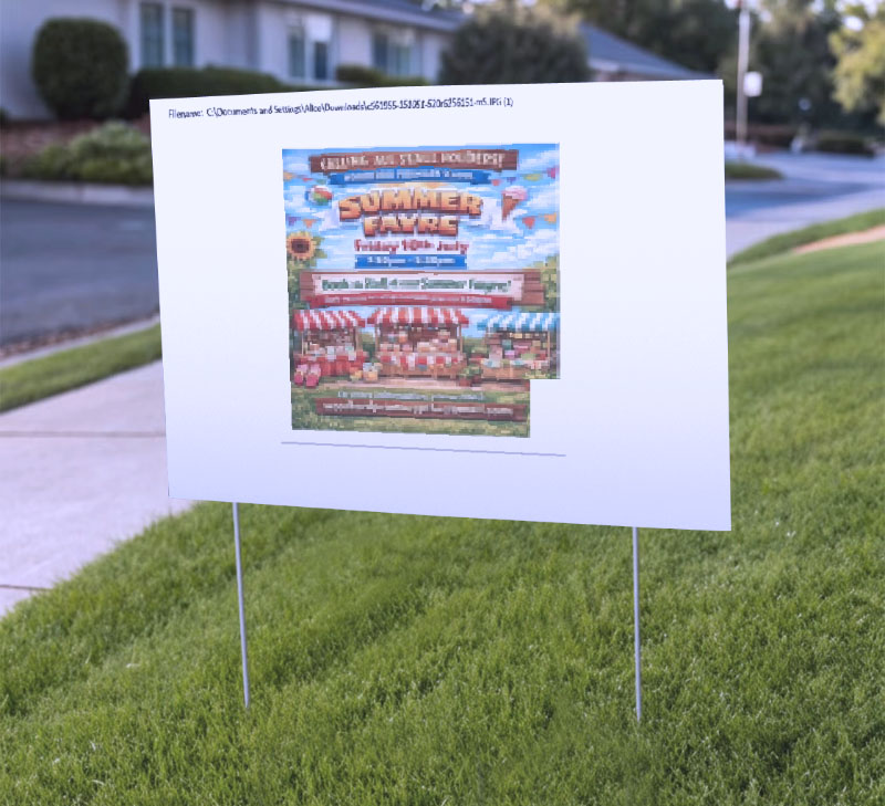
Ach, idk. On average people have horrible design aesthetics, yet are now so arrogant about it, because they imagine their a newly found ability to spot design generated with AI equates to them being able to spot bad design.
No, you silly geese. What you are able to spot is somebody using AI poorly. That's not you developing taste. It's the equivalent of being able to tell something is photoshopped because somebody used a default brush poorly, or masked something poorly and then confounding using Photoshop with using Photoshop poorly.
You have absolutely no way of telling when a good designer created something entirely using AI (unless they are fine with you knowing that) and that has always been true.
One thing I've noticed with AI posters is that they're all "flat" in terms of attention. For whatever reason, they result in a post where every part is on the same level visually, and your eye does not get drawn to anything. You can't immediately see what is and isn't important.
The bad posters are absolute disasters in this regard. (And completely irredeemable in general! They are not "OK" in any way.)
But the better-stylized examples in the article aren't much better! Most of them have the same tendency. Only the minimalist Japanese and 40s Cubist styles do much better, and even those aren't structured amazingly. If you tried to add more information, I bet even the minimalist styles would become a flat and confusing.
This is the same problem I have with stock Claude prose and code. It's verbose, sure, but worse is that there's no quick way to tell what is and isn't important. In good code, you can understand the shape of the code at a glance; AI code is pretty much the opposite of that. And so are AI posters.
The author claims that the AI posters don’t have to be horrible, but fail to see that the dozen variations generated are not distinctive - they might have somewhat different typography or imaginary, but still have the same AI uniformity and smell as the crappy restaurant poster you see on the street. The core issue is not only technical, but also the lack of vision and imagination when creating art or even infographics.
This is not about AI. This is about human taste. AI generated the posters. But then a human looked at it and said “this looks great, I’ll take it”.
The same person would have taken the same design from a “designer” if they could afford it. So it doesn’t matter if it’s AI generated or not.
People who complain about this, should build a product that will use AI to develop human taste. That’d be a better use of energy.
>The problem with these is not so much that they’re bad. They’re OK, I don’t love them. The problem is that once you’ve seen that style 20 times it starts to irritate just from the sheer repetition.
This is one of the better statements of the issue right here. I think because people dislike the actors and economics surrounding AI they also feel a need to categorically reject any of it's products, but it's not necessarily bad in the sense of poor aesthetic taste as it is bad in it's lack of a appreciating that being novel as a style matters almost as much as the actual style and direct repetition teaches us not to like the style itself.
I think this is an unfair comparison. The "better" AI-generated posters in the article are all much more minimalist.
Minimalist designs have much less opportunity to insert "personality", be it that of a designer or that of an AI. No wonder they look less AI-generated, and when they do it is because some "AI-baroque" slipped through. Fancy unicode characters no human would think of are the salient one in OPs examples.
It'd be much fairer to compare AI and human for the same desired style, and yes a lot of AI-generated stuff is immediately recognizable because no one bothered to tell the AI about the desired style.
The examples all look off because the author keeps using "Spring Fayre" as a lorem-ipsum for styles that do not match the vibe of "Spring Fayre at the brewery". Distant second is that they have this sterile "Microsoft Word Template" feel that needs to be sanded off another way.
I guess you can justify ignoring such "advanced" techniques if it's aimed at the literally-zero-effort crowd, but who from there is reading this?
I work in a copy-print center where we take orders for business card, posters, flyers, invitations, and all sorts like that. Lately, I have been getting more and more AI generated artwork for these flyers and business cards, and they are not sized correctly. I can tell it's AI generated not from style, layout, or even hallucinations, but just the size. The background are a full color, the customer insists that it's the right size, but I have to tell them that if I print what they gave me, there is going to be large white borders on the sides, tops, or all around. I have had to explain to too many customers that AI doesn't know what an inch really is, as the reference images it has are different sizes. AI flyers could be the best design ever, but it will never be sized properly and will still piss off the print employee.
And I have found that if you are paying for an AI service to get these generic, wrong sized designs, you could have spent just as much going on Fiverr and gotten something that doesn't need to get a full style revision.
> One note here is that along the way, the poster has acquired extra text (“A day of music making and family fun”) – it’s decided that Designers Republic would have thrown in some text of that kind, so it’s come up with some words. Those words are now in the chat context, so they appear in subsequent posters.
This is very important for programming and I don’t think enough people are cognizant of it
What's interesting is that you can't do the same with long-form AI prose. You can ask any given LLM to write in different styles, but it will always fall back on the same rhetorical and structural techniques, so the "new style" is strictly surface-level. In fact, it's getting worse over time -- especially in Claude from Opus 4.6 --> Opus 5.
I suspect that the same thing is happening here -- as other comments note: lack of distinctiveness, uniformity -- but that the low information content of posters prevents it from becoming immediately obvious.
Buried at the end of the article the author linked a library of different art styles applied to the same poster content. Found some new cool art styles to try out in the future. https://john.hartnup.uk/poster-prompts/
We just have to accept that we’re now living in the age of industrialization of any skill that is digitized. And on average that means it’s not better than what a qualified professional can produce, but it’s good enough, and good value for money. Just like IKEA furniture is not better than anything that a skilled carpenter can create, but most of us settle on industrialized furniture because we don’t have the budget for better, or we prefer to spend it elsewhere. Similarly, most companies don’t need bespoke posters nor software.
The original posters were better than any of the mockups.
Not because they looked good, but because they used a design language that "at-a-glance" said what the event was. Sure, the designers republic/etc looked less commonplace, but if I was looking for a fun local faire I would absolutely never notice those posters and if I went i'd assume it was a completely different type of event than it is (e.g. some sort of modern art faire).
Every one of those posters didn't fit the medium idea at all (local faire event) except the child's drawing one could maybe pass.
In fact I can almost guarantee that all the posters in this article would perform worse than the originals if you were to test them on the street or in a facebook group.
If you are an actual production/commercial designer, your first goal is to understand what the clientele wants and converts, secondarily make it beautiful.
This failed both, zero understanding of the purpose of commercial art (to speak to the actual clientele and bring in more people) and ugly within their own design language (but yes, less common).
Would have been interesting to try and make designs that actually make sense for this product AND are a bit less generic.
At a certain point, pottery that looked like a child made it became the high end, because well-executed pottery was coming out of machines.
We've officially reached that point with advertisements. Save your tokens. Hire your 9-year-old niece to draw the poster by hand and you'll likely get a far better reaction from most people. Nobody goes to a fair because the poster had a "modernist / Bauhaus-influenced graphic style".
Everyone's sick of seeing the same default ChatGPT style on posters for everything from village fetes to coffee shops to school plays.
But I'm convinced that just vetoing AI is to throw away the baby with the bathwater. So I set out to prove it.
But the thing is, all have that icon+text style in the "tombola, cakes and drinks..." part. If I wanted to be distinctive, this is what I would have tried to get rid of at first, not the "visual style" (it's sort of like Windows XP visual styles, no matter how different they are the overall layout is still recognisably Windows).
I think we're in the 'early digital camera' phase of AI art gen.
The real photographers knew they were shit photos. They were grainy, bad lenses, and ugly. A lot of people still liked them because they were much more convenient for a lot of uses than the film ones.
Well, I guess there's still a lot of film people. But film had a ceiling. Digital cameras kept getting better.
The adaptive film photographers eventually adopted the tool. A lot of their skills transferred well to the new medium. Most waited until the cameras got good enough, though.
I'm not sure when that'll be with AI art gen. Seeing scenes broken up into layers in the latest gpt image generation, though, made me think we might be near.
Leaving aside the quality of the different posters here, I think the interesting question is where did the default AI generated style come from? It's certainly not one of the styles listed if you interrogate chatgpt, it's not something it seems to be choosing to do.
I think the signature noisy, crowded, HDR-y look shows these posters are being spat right out of a diffusion model. They always have an image background with the classic light halos around text.
When I one-shot a poster out of Gemini or whatever, I can't make anything nearly as bad as the ones I see every day. What on earth are people even using to make stuff that bad?
Contempt for art is what this is.
For example, Sure, you can make a craven facsimile of punk art for your poster. But that art style signals to punks that other punks are going to be there. You would never reproduce that style using traditional methods because you are not a member of that artistic tradition.
You should keep the originals. They signal to AI slopsters that this is a great place to meet other slopsters.
The point really isn't just the use of technology. People don't complain when a hand drawn poster is photocopied! The issue is that it's taken a human out of the creative process _and_ it's using the plagiarism machine that is also making everything worse while enriching a handful of the worst people. It's a sign of how lazy the event organizer is, and how little they care about people, which is especially foolish for an event where you would like "people" to show up.
I'm a big fan of FixIt Clinics, i.e. community repair workshops. Here's an example of one of their posters:
https://allevents.in/mattapan/fix-it-clinic/200026636930752
Here's what I like about it: it communicates. What, when, and where. And crucially, photos showing what the event looks like. Photos of real people fixing real things.
The author demonstrates that AI-generated posters can imitate many artistic styles besides the generic default, but these examples suffer the same problem as all template-based posters: they don't communicate what the event is actually like. What does a samba band performance look like? (There are drums, I guess?) What does a circus skills workshop look like? (There are juggling clubs, I guess?)
These posters may be more aesthetically pleasing but none of them make me interested in going to the event.
This is good to know, but the kind of folks who use AI to create their posters and menus aren't going to be able to be so specific. They'll throw the details at an LLM and take whatever they get the first time. What matters is they didn't have to pay a designer (they ignore that they're paying a subscription).
> The problem is that once you’ve seen that style 20 times it starts to irritate just from the sheer repetition.
But that's how the algorithm behind LLMs functions. It simply cannot create something unique by stepping out of its existing knowledge base. It has to refurbish existing data, because, well, that's all it has.
One might argue that a human artist also is refurbishing data, made out of experiences and knowledge it has gather throughout its life.
The difference I think comes from something extra (that we're entirely dumb-founded on) that the human mind can contemplate and extrapolate from, to be able to generate something truly unique and different.
I hope (and believe) this extra magical capacity is what will not allow AI (at least in its current statistical form) to be able to match us in terms of creativity & uniqueness.
This feels like an AI trap almost. A lot of the badness comes from people who don't want/can't put effort into it, so we all get a deluge of the sameyness.
Designers republic and memphis were the only designs i couldn't immediately see were AI generated.
The only reason i couldn't tell memphis is because it's aping a known design language already, it's just a perfect copy so me not being able to tell it wasn't AI isn't a free pass in this case.
I think if there was a little less "grid" feeling to the layout details then i wouldn't be able to tell on a few of the other designs either.
Edit: the designers republic version is quite a lot different than the others, it's not just that it's the only design to avoid pairing every feature with an icon, it's the whole layout variety - there's different font sizes, the positioning of elements is very well done to my eye. I'm gonna say this has to be another case like memphis, there's some pre-existing design language that i don't know of and it's just aping that. It's much more human than the others which i can believe are straight ai.
"Me: a poster paint drawing by his young child."
Some time ago, I was in this apartment complex and there was a hand drawn sign of a dog pooping on the grass - the sign then said that residents should pick up after their dog. It looked like the locals living in the apartment complex had their child draw the dog pooping in a slightly adorable style. I remember feeling kind of happy about this, like I could see a kid sitting there with some crayons painting this dog. I know there were human artists perfecting this child like style before but still feels like some humanity is getting lost here making AI paint like a kid.
This has always been what irritated me about the AI poster style, is that I could tell that zero creativity or effort was involved. It is not that difficult to spend some time with an image generator to make something unique that even the staunchest AI art haters would probably not notice.
I see, across my city and others I visit, every bar/restaurant/etc now has low effort one shot posters, menus, etc, some with old chatgpt nonsense text / errors. It's everywhere. All that brown-ish hue food 'pictures' etc. I mean 'authentic Pizza napolitana!' and then an AI generated picture of said pizza... One of them (an Italy born Italian restaurant owner here) and he just said; people come in with the very expensive pictures / menus I had before and the same amount of people come in with these free ones. And he actually likes these better as photographing (real, not mcd/burgerking plastic props with poison paint to make it look better) food is hard, even when paid for.
Is there an explanation for why AI images, or posters, look "AI"? What I mean is that even some of the better ones, that I quite like, have a distinct AI look that I can’t quite put my finger on.
Some elements are, the very saturated color or being overly busy, but not all images have these tells, and not all of them.
For a while I thought it was that sort of very subtle dithering/texture that a lot of the images have, but again not all of them.
Looking online, most seem to focus on things like the wrong number of fingers, things merging into one another, details that don't make sense, etc., but that’s not what I’m talking about.
Does anyone have an explanation for why they are this easy to recognize as AI even when they are decent?
This is misunderstanding the problem really. People don't hate ai posters because they are bad, they are technically better than many normal posters. They hate ai posters because they hate ai generated work and desire to just be done with the whole thing.
By that logic they hate this even more because now its harder to tell its ai. This is really a person hating the means but using the ends to justify it rather than stating so outright
I think this is a misdiagnosis of the problem. The AI posters are just fine, perhaps even pretty good.
The problem is that using AI to create the posters show a lack of willingness to put in effort, and it makes you question whether the producer cares about the product and whether they care about the large scale societal problems related to the usage of post-2022 transformer based neural networks.
Small businesses torching years and years of propaganda and goodwill lavished on them, so they can save the $50 it would cost to have a human design a decent-looking poster.
Sure, you can get any style you like, but /you will pull those little icons lining the list of activities at your county fair from my cold robotic hands/
Generative AI is actually pretty good at giving you rough concept sketches and iterating on top of existing renders.
However, you must retain control over the scene graph and its composition. Use the output of the AI to guide how you work it. Do not assume the AI system has the ability to simulate world space with any meaningful fidelity. You can move transforms around in Blender and Unity with floating point bit increment/decrement operations if you wish. LLMs will never have this level of control.
Lighting systems are an entire universe of reasons you should do it the hard way too. Being able to iterate light placement and intensity with nanometric precision starts out looking like a brick wall, but it turns into a superpower once your scene is halfway decent.
I can usually tell when someone used AI to do things like generate steam store art because their camera doesn't change in a physically plausible way between the horizontal and vertical layouts. When you have access to the raw scene you can place the same camera in multiple orientations without altering any other aspect of the scene. The header capsule and vertical capsule are very difficult to make look coherent if you are using an LLM to generate these assets. Your best bet with AI art is to render something so big that it can be cropped for both, which is also quite obvious and ugly. Being able to instrument a scene as if it were a real place is way more productive than an LLM once the scene is ~done.
This is barely prompting 101. Author is essentially saying "instead of asking it to just make a poster, ask it to make a poster in [aesthetic]."
This has nothing to do with design. Is bauhaus the best aesthetic choice for a spring fayre? Why or why not?
I went to our state fair recently, and there were so many advertisements for their food that was AI generated, and I suppose if the food looked anything like what was depicted maybe I wouldn't have had a problem, but I felt "tricked" into buying something that appeared good, and turns out, looked nothing like what it was. I overpaid, and didn't even end up eating 1/4 of it. I'm not sure if this quite falls in the same vein as the og post, but it definitely made me feel that way.
I should be fair (no pun intended) there was one booth that had mini donuts that I felt were better than the AI generated poster advertisement, but the rest of the food I ate, was certainly not.
The comments seem to have the consensus that these designs are just "ok"
But to me it still seems genuinely amazing that LLM's are able to generate graphics of this high quality with the text and narrative correctly positioned.
Blown away, but also quite sad, about the future of creative endeavours like graphic design
The thing about the icons next to each phrase is that they are useless. Forget how they look, instead ask why they are there? Icons in UX design give a visual representation of what a button does, to help people understand the interaction with the UI. Well, these are posters. There are no buttons. It shows a fundamental misunderstanding of why an icon exists in the first place. (And yes, this is true for many of the places where AI throws in icons.)
That is why, even if the look of a poster is OK, they are failures. Because they forget that the reason these advertising posters exist is to communicate something that is going on. A nice look to them is a bonus, not the core purpose. So claiming that AI isn't doing a horrible job is because the author is misunderstanding what the job is in the first place.
One trick that works from IRL is building a moodboard. Go to Pinterest, find what you like, paste it together.
If you're short on time, you can ask AI to summarize into a certain time and craft the prompt from there. But it's better to figure out what you really like.
ChatGPT tends to fall to the same things, but many of the other image generators do much better.
I'm old enough to remember the Desktop Publishing revolution in the early 90s. There were so many awful posters, flyers and such that actual people made. My favorite was a preschool flyer where they used the kidnapper font.
This post showing that creativity will make you the winner in this AI era.
I love how the AI silently injected "A day of fun for all the family" on the hand-drawn by a child design.
PS: Which then survives in the next iterations as "A day of music, making and family fun"
Edit: Ah just saw the call out on the previous iteration.
But still it's a nice display about the semantics encoded in the models.
I love this posting. Taste is something that needs to be worked for. It doesn’t matter how well the tool renders the output if the tool user has not taste (me included).
In the future I think that users will learn more, and tools will get better. The true tell of AI usage will be that a small organization will have a beautiful poster. That was never possible in the past.
A lot of people in the comments say that the supposedly better examples in the article are still “horrible” because they can tell they’re AI and point to things that the AI did “wrong” and a human artist would do better.
That may be true if you’re working with a top of the line artist, but in my experience the average freelance designer online is significantly worse than AI. I’ve worked with dozens of budget friendly designers on Fiverr and consistently get way worse results than I’ve gotten from AI models. Will a great human designer produce better output than an AI? Maybe, but a small local event or business probably won’t have the budget to hire them or know where to find them. It’s cheaper, faster and easier to use AI to generate something that’s good enough for their purposes.
People also point out all the little flaws in the “good” examples and cite them as obvious tells that they were AI generated. I think it would be interesting to see if people could reliably distinguish between AI generated flyers and human made flyers. Sure, sometimes it’s obvious like when the AI adds those weird, cartoony people. But if the model is told not to create designs like that and stick to the styles used in the second half of the article, I expect people would have a much harder time distinguishing the human designs from the AI designs.