The struggle of resizing windows on macOS Tahoe
Comments
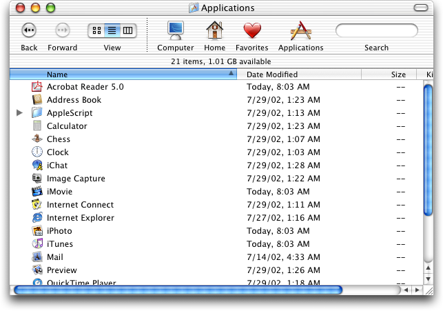
Compare to Aqua and Platinum where every resizable window/pane had a big square drag target clearly labeled as such with some diagonal lines:
https://guidebookgallery.org/pics/gui/system/managers/filema...
https://guidebookgallery.org/pics/gui/system/managers/filema...
I swear, this reign of visual artists as dictators has to stop.
I'm sure people noticed this issue internally and brought it up but some thing by some designer was seen as biblically sacred and overruled all reason.
I've been at companies were you get severely punished... sometimes fired for subordination for fixing an obviously broken spec by a designer emperor.
It's normal to be "I guess 2+2=5 here, whatever" as if the designer went in a tiny room, had a seance with the divine...
Yo, newsflash, everyone makes mistakes. Failure is when you force them to stay uncorrected.
This post is very well presented and it highlights how absolutely bizarre the latest update was. The video demonstration was also very well done.
I remember a few years ago, people complained when Apple merely made the entire operating system uglier. (Something about a gradient on the battery?) A lot of people would talk hyperbolically ("apple KILLED macos!"), and that's indistinguishable to an outsider when an update like this brings other people out of the woodwork to say, "Hey, these changes are genuinely bizarre and absurd, what happened?"
This behavior is similar to Windows 11. You have to position the mouse just outside the window. It is non-intuitive and awful.
These are problems humanity solved over 35 years ago (see NeXTSTEP). Why are these designers breaking basic features that worked for over 35 years?
Does anyone know if Stephen Lemay replacing Dye will potentially "save" the increasing mess that is OSX, at least UX wise, or is it more of a meaningless figurehead swap in a big org?
Tahoe is tragically bad by almost every UX measure, and following various Apple subreddits i wonder if they just don't care anymore - since the majority of people are shocked by the amateurishness of both bugs and design choices in the latest update - this comes on top of literally every major bug being ignored from the alpha to releasing anyway then continuing to ignore feedback.
I love how this information is produced. Succinct, excellent and simple visuals, clear argument, and a solid amount of sarcasm and cynicism to keep us entertained and to provide an air of senior technical person.
When resizing, I expect to drag from the edge of a window. This is exactly how it works in macOS Tahoe, with a sufficient drag zone on the both sides. The only "strangeness" is that the drag zone extends further outside the window in the corner zone. IMO this is nice.
All that said, I REALLY would love to have a hotkey combo I can beep pressed down to resize anywhere over the window. Just like in many Unix/Linux window managers.
My biggest peeve with macOS Tahoe is the App Launcher redesign.
It seems like a clear regression in usability. By moving from a high-density, full-screen experience to a constrained, scrolling window, they’ve increased the interaction cost for launching apps via the mouse. It feels like a 'unification tax. Sacrificing desktop utility to align with non-Desktop modalilties. Does anyone see a functional upside here, or is this purely aesthetic consistency?
Why does the UI have to change all the time? Can't they just keep it the same?
If cars were like computers, the steering wheel would be in a different place after every maintenance check.
Anyway, I'm on Linux, using Gnome Classic as my WM, and I don't have these stupid "everything is suddenly different now" issues.
I use easy-move-resize [1] to resize windows from anywhere inside the area of the window, using a modifier key. In my case I like using cmd + middle mouse button + drag.
This is standard in Gnome and a must for me back when I switch to MacOS for work.
Tahoe is proof is that UX for desktop has finally jumped the shark.
In all my years using computers I have never been so disappointed so profoundly by a 36 gigabyte operating system upgrade.
I noticed this and modified the .car to just make window corners sharp. It looks a bit jarring, but functionally speaking, it feels like a big improvement.
Should we crowdfund some billboards in Cupertino expressing how big a misstep we collectively think Tahoe/iOS 26/Liquid glAss was?
Result of UI people work on UX. As an industry we need to de-hyphenate UI and UX.
I don't really care if it's because of bizarro designer hegemony, device unification, cost cutting, bad developers or something else, but it's astonoshing how far the desktop paradigm has fallen (and not just in MacOS). What baffles me the most about things like this isn't that crap slips through, it's that crap accumulates in an alarming rate and that apparently tech-savvy people aren't just seemingly fine with stuff like this, but will happily step up and defend it.
I find it very ironic that Apple's Mac hardware is the best it's ever been, and some of the best (if not the best) in the entire industry, yet their software team seems intent on burning down their entire reputation. Maybe they think that's better than getting fired over the laughingstock that is Apple Intelligence
Use rectangle and this will never be a problem for you.
Rounded corners are ironically symbolic of the dumbing-down that's affected the software industry. Instead of the sharp precision of 90-degree corners, we get vague curves that don't make sense anymore as though the corners have been worn away.
FWIW: option double click sny corner to make any window full-screen without going into full screen mode.
Double click any side or corner to move it to the edge of the screen, and hold down option to make the effect symmetric.
Are we reaching the death of UI design? Feel like we're now at the point where being mid-bad makes something one of the best for many.
I miss Windows 7 and OS X.
Maybe I'm too old and every modern computer is a marvel to me, but as someone switching between win/macos/linux all these complaints amuse me. While in windows I'm using powertoys and I can move/resize windows using any space inside a window. It's the same with linux/gnome - a couple of config settings. Then, when I started using macos I looked for a similar solution - found BetterSnapTool and just started using it.
Apple is at the point where they need a Jobs-ian correction again.
Steve Jobs would have had a fit over this product line. As '97 era Jobs put it, "The products suck! There's no sex in them anymore!"
My modest proposal for Apple diehards (especially employees) is to feed all the data that exists on Jobs into a multi-modal model so that Apple can hear just how much their shit sucks from Jobs' digital ghost.
A good starting point would be the https://stevejobsarchive.com/
After using Tahoe for a week, I've found I leave it in my bag. Window operations are painful and it feels like a bad try at a tablet os without a stylus or touch screen. Fortunately, my Mac is now the auxiliary laptop and I can do everything I need to do with my linux laptop.
I highly recommend Moves, which makes it possible to resize with a modifier key drag within any part of the window: https://mikkelmalmberg.com/moves
Never noticed this change, but unlike the blogger I never try to grab the window inside the corner. I tend to aim for the edge itself.
Also the resize cursor is completely unreliable, the cursor often doesn't change to the resize one when the mouse is over the correct resize areg. So it's even harder to tell if your cursor is in the right place before clicking. If you click in the wrong place it can have frustrating consequences, like activating another window or even clicking something inside it.
I have been using Rectangle and Spectacle before it. Wanting to resize windows like in this article isn't natural to me anymore.
Of all the Linux features to copy, they chose this.
Apple really screwed the pooch on this last set of UI upgrades. They have been known as UI experts for decades and then they produced this unusable mess. I’ve upgraded my iPhone and iPad, but I’ve been delaying upgrading MacOS, hoping that they will fix most of the mess before I switch. If I was Tim Cook, I’d be looking for a scalp. This is as bad as the butterfly keyboard mess in terms of usability, IMO.
I just saw the upgrade notification and thought to myself "no, thank you".
Still running Sonoma on my MBP and iOS17 on my phone.
This controversy could have been avoided if the GUI changes in Tahoe had been opt-in only. In other words, the Sequoia GUI should have remained the default, with the option of choosing to switch to Liquid Glass.
That's funny. I perceive resizing windows as easier now, because the cursor change is more dramatic when it gets in the resizing area. Pre-Tahoe, the diagonal one in particular looked almost the same, except with an arrow end in the bottom. Now it splits into two triangles.
I still operate off muscle memory, so it's not actually easier or harder, of course.
I thought this was going to talk about the struggle of sizing windows to arbitrary widths. I often try to keep slack and my email windows side by side and Mac OS seems to go out of its way these days to frustrate my efforts and maximize the one window or the other.
The resize corners grab area is also very frustrating though.
I'm hoping something like this takes off on FreeBSD: https://github.com/gershwin-desktop/gershwin-desktop
I've only owned macbook laptops but have run Linux at work since 2002. The lack of cohesion and non-stop changes in Linux is just as tiring and this MacOS Tahoe stuff. Gnome 3 cared just as little for users. FreeBSD + KDE Plasma is pretty good now, but lacks feeling and design.
Just this week it also dawned on me the impracticality of the large corners after twice in a row failing to grab the corner of a window. Tahoe is absolute amateur hour.
I haven’t had to move the mouse near a window corner to resize it in years — I just hold down the Shift and Fn keys and the window under my mouse resizes as I move it. Strongly recommend getting BetterTouchTool for this - changed my life.
I game on windows because of anti cheat software requirements. Windows is garbage. The windows + tab order is never consistent. Not having a good built in shell and don't get me started if you ever have to edit the registry for anything. Super poor experience.
Seems very clear now that we are going to see touch screen MacBooks. Which is a very silly idea. But explains why the UI "snaps" like an iPad, and everything is designed for touch.
tribunals
the cherry on top is the delay between the drag start and the window begining to resize
I have been using Moom for a long time for especially two things:
- moving windows without holding from any particular position
- resizing windows without grabbing a particular corner
Life changing small things.
All that 'glass' eye candy is a sheer sign that looks is more important to Apple than usability. And I don't even care for how it looks.
Unrelated but iOS 26 is so bad and janky that I've finally decided to switch to an android phone. I hate it so much. Thank god I haven't upgraded to Tahoe.
Who asked for those rounded windows anyway? They create so many problems; every app has its own border-radius, and it wastes precious screen space...
The era of Apple design with great care to little details is long gone.
It's obvious, the new Apple UI (and Liquid Glass) is optimized for visionOS, not macOS or iOS.
I'm on macOS 15.4 on a 2021 M1 Max. I haven't rebooted for months.
Is it possible for me to update to whatever was released just before "Tahoe", or will it just put me on that now?
Its not a great update and hopefully with Dye out they will make some changes, but personally I don't have this issue.
That's genuine 2000s Linux experience there. Ironic that these days Linux provides a more refined and consistent UX than both MacOS and Windows.
Tahoe is a macOS mis-step on par with Windows 8 or Windows Vista. If you’re from Apple and reading this, my feedback is pretty succinct: “I don’t recommend others upgrade. I wish I didn’t.”
Luckily for Apple, Windows 11 is not exactly in a position to attract switchers.
Let’s see if Apple can turn things around. iOS 8+ did improve on iOS 7’s worst bits.